Soho House, a luxury hospitality company, operates exclusive members’ clubs in locations worldwide. Across several decades, the company has built a diverse global membership community.
Elsewhen recently worked with Soho House on a 14-week engagement to give its customer app a fundamental overhaul in terms of user experience (UX). We researched and validated a range of essential improvements to the app’s usability, content, and functionality — and helped their app team take a more customer-centric development approach.
Apple App Store rating rose to 4.9 out of 5
90% positive customer feedback
Reimagined app usability, content relevance, feature discoverability and user engagement.

Overcoming issues with app navigation, usability and engagement
Soho House provides its members with a mobile app to help them get the most from their club membership. However, the business had identified a variety of problems with the app that needed addressing. The existing app had been developed in-house, and Soho House wanted Elsewhen to provide an expert outside perspective on how it could be improved.
Members primarily used the app to book club restaurants, leisure facilities, and accommodation. While the app also included other membership content, its design was unclear, particularly on the home screen. The confusing navigation and structure left members struggling to find information and complete desired actions.
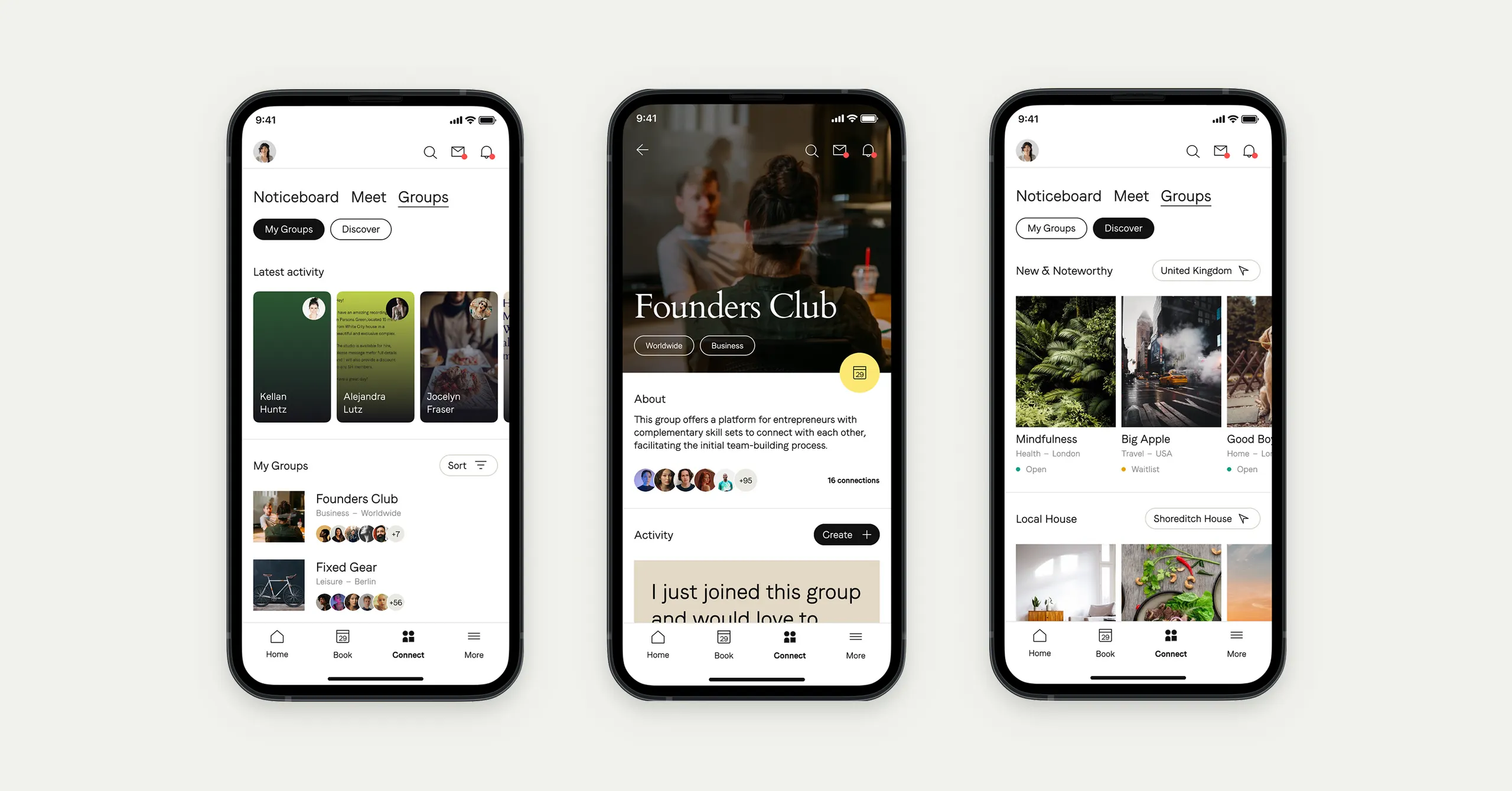
Another aspect of the app needing a rethink was how members meet and connect. A feature had previously been introduced in the app to encourage members to interact and engage with each other. However, the implementation had not been fully worked through, so awareness and usage of this member connections feature was very low.
Product strategy
User research
Customer insights
Jobs To Be Done analysis
Design for key customer journeys
Digital product design
UX design
UI design
Prototype design

Bringing a more customer-centric focus to digital product improvement
Elsewhen worked closely with Soho House’s Chief Technology Officer (CTO) and leadership team to plan and implement a 14-week project to address these high-priority issues with the app. We focused on resetting the core app product and process to help Soho House’s team work in a more customer-oriented and experiment-led way.
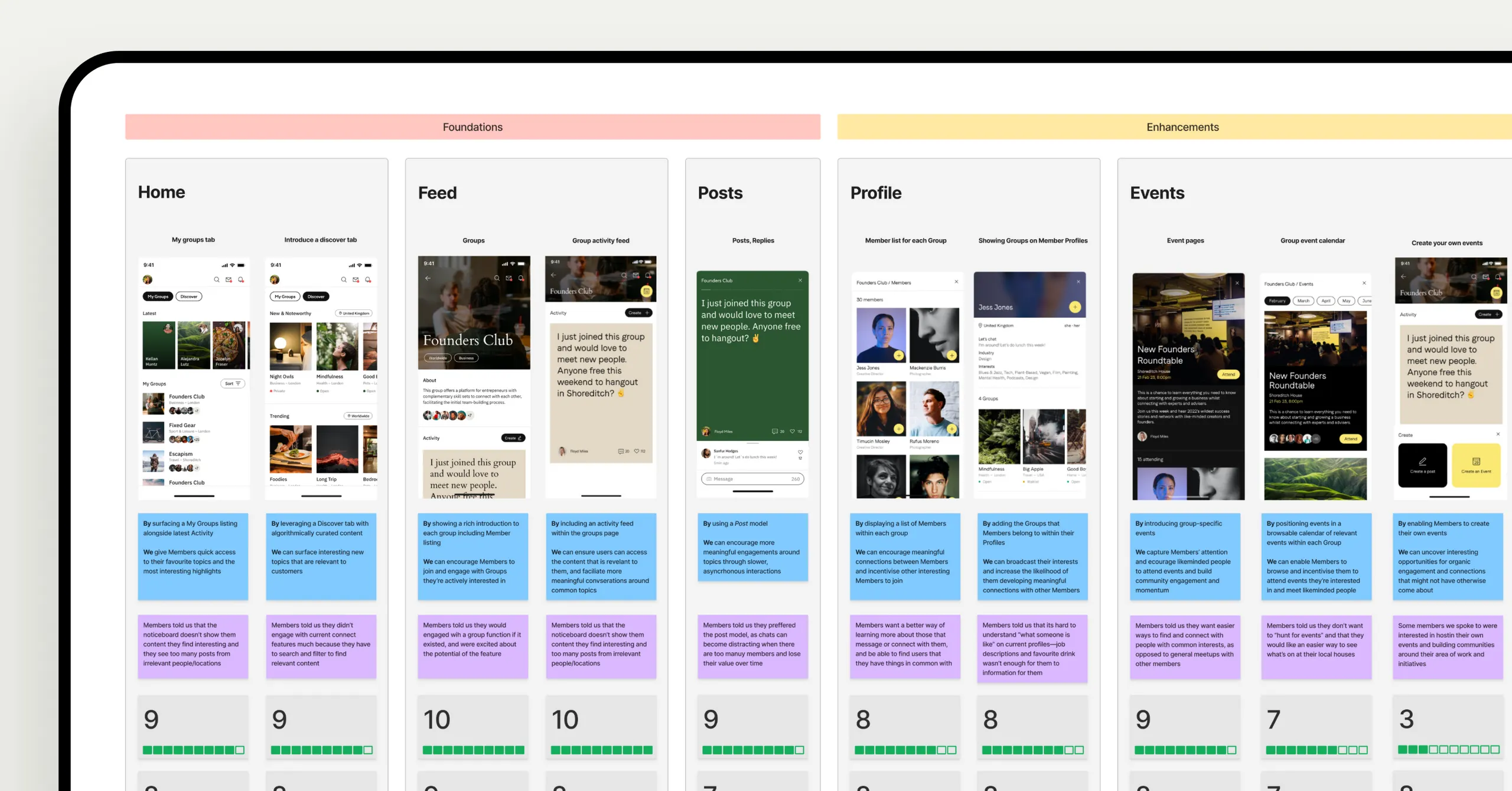
We began by researching and rethinking the key product areas: designing a new navigation system and coordinating its initial implementation. We identified opportunities to improve the home screen and redesigned the interface to support these improvements. Additionally, we worked to understand and enhance how members connect and interact through the app.
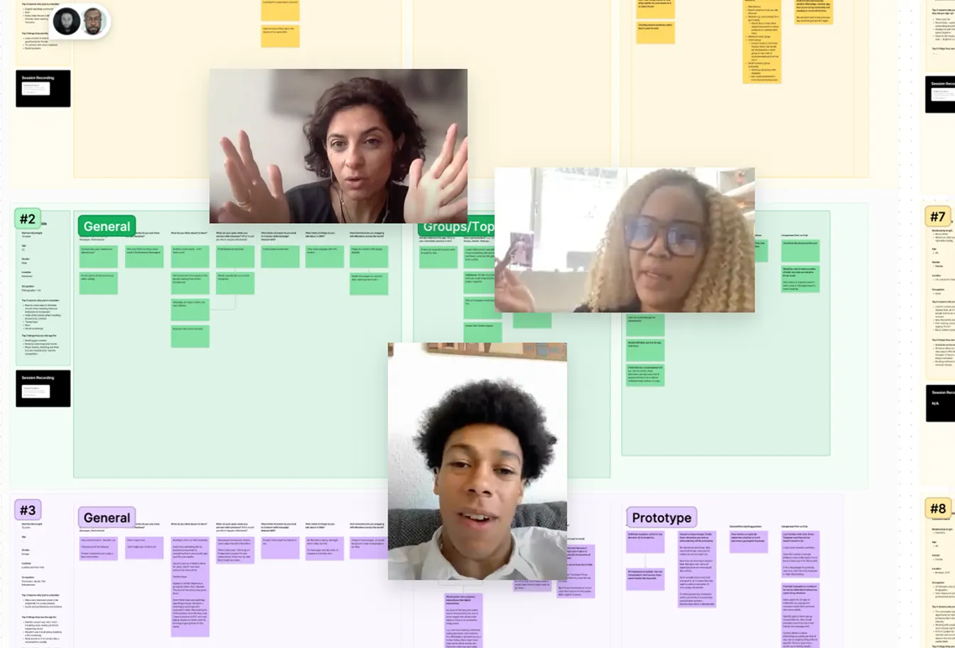
We ran three workshops with the Soho House team to understand their challenges, priorities, and objectives. We also conducted seven customer interview sessions to gather real-world user feedback from a diverse range of members. We then synthesised the insights gathered to “connect the dots” on how to improve the app.

Applying evidence-based thinking and design excellence
During the discovery phase, our team researched and validated hypotheses on the key app issues. Subsequent phases developed design recommendations for improving the app.
We verified that users did not find the existing sidebar-menu interface and structure to be an intuitive way of navigating the app—some users weren’t even aware of the menu’s existence. We recommended switching to a familiar tab bar navigation model to support tried and tested interaction patterns. We also designed options for a clearer and more brand-consistent user interface (UI).
We confirmed that most members primarily used the app for transactions and bookings, with browsing content being a secondary activity. This highlighted the need for the app to be redesigned around enabling these primary member needs. At the same time, we designed home screen options to present other relevant features and content in a more considered and helpful way.
We helped Soho House enable a step-change in customer experience

Building a clear way forward for stronger customer relationships
Overall, our work equipped Soho House with research, recommendations, prototypes, and an implementation plan to overcome its biggest app challenges.
We helped Soho House build an evidence-based, experiment-led team culture where user testing is central to any ongoing product improvements. Following our work on the app, its user approval score on the Apple App Store rose to 4.9 out of 5 (as of November 2022), and 90% of users provided positive feedback on the updated app in a recent Net Promoter Score (NPS) customer survey.
We also helped Soho House understand and improve how members connect through the app experience. Our improvements generated strongly positive customer feedback that the team can act on in future app development.
Following our work on the app, its user approval score on the Apple App Store rose to 4.9 out of 5 (as of November 2022), with 90% positive feedback

